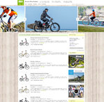
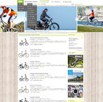
Hey guys, I'm in the process of redesigning EBR and welcome input and requests. If anyone is a graphics designer, feel free to add to the mockups!
It's an exciting challenge to create a fully responsive design that can be monetized authentically and deliver information in an efficient intuitive way. I like the existing EBR but feel it's a bit too skinny now that we're seeing 4K and with VR right around the corner, I want to create something a bit nicer at high resolution. Maybe even do future reviews with 360 degree 3D cameras like this. Don't worry, it will still be fully mobile compatible, possibly "mobile first" for improved load time.
Here's a basic mockup I've been working on (the first image is without hover and the second is with hover examples). Other things I'd like to add are a brand overview + logo at the top of category pages (maybe with an averaged rating for the brand based on reviews?), a map with dealer locations that zooms in based on user location, a full reporting suite for advertisers and shops and integration between these forums and the site. I may also re-theme the forums to match this layout so the transition is more seamless.


Sites that I like and frequent for design inspiration include:
It's an exciting challenge to create a fully responsive design that can be monetized authentically and deliver information in an efficient intuitive way. I like the existing EBR but feel it's a bit too skinny now that we're seeing 4K and with VR right around the corner, I want to create something a bit nicer at high resolution. Maybe even do future reviews with 360 degree 3D cameras like this. Don't worry, it will still be fully mobile compatible, possibly "mobile first" for improved load time.
Here's a basic mockup I've been working on (the first image is without hover and the second is with hover examples). Other things I'd like to add are a brand overview + logo at the top of category pages (maybe with an averaged rating for the brand based on reviews?), a map with dealer locations that zooms in based on user location, a full reporting suite for advertisers and shops and integration between these forums and the site. I may also re-theme the forums to match this layout so the transition is more seamless.


Sites that I like and frequent for design inspiration include:
- IGN https://www.ign.com (clearly I've borrowed from their header)
- The Guardian http://www.theguardian.com/us
- WSJ http://www.wsj.com/
- Blue Ray (Link Removed - No Longer Exists)
- Ebike Base http://ebike-base.com/
- KBB http://www.kbb.com/
- Edmunds (Link Removed - No Longer Exists)
- The Next Web http://thenextweb.com/ (works well on mobile)


