Which colors looks better?

Ravi Kempaiah

Well-Known Member
Region
Canada
City
Halifax
We have been working with a professional branding agent as part of our website revamp, brand identity, and launch activity.
We would also like to include feedback from prospective customers and knowledgeable E-bike folks here.
Please let us know which option you like the best and you could share your preferred ranking of the options presented here and this would help us narrow one particular design.


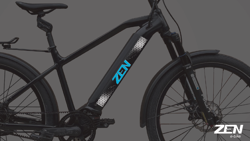
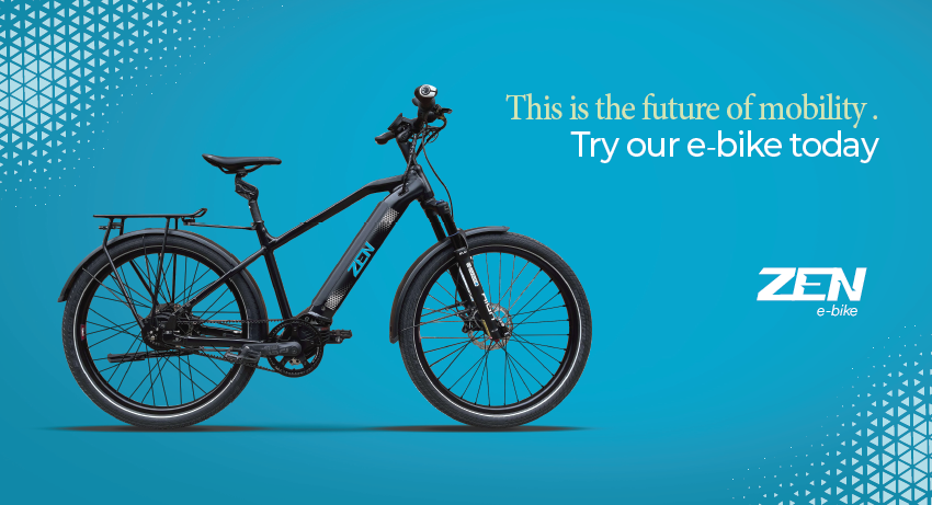
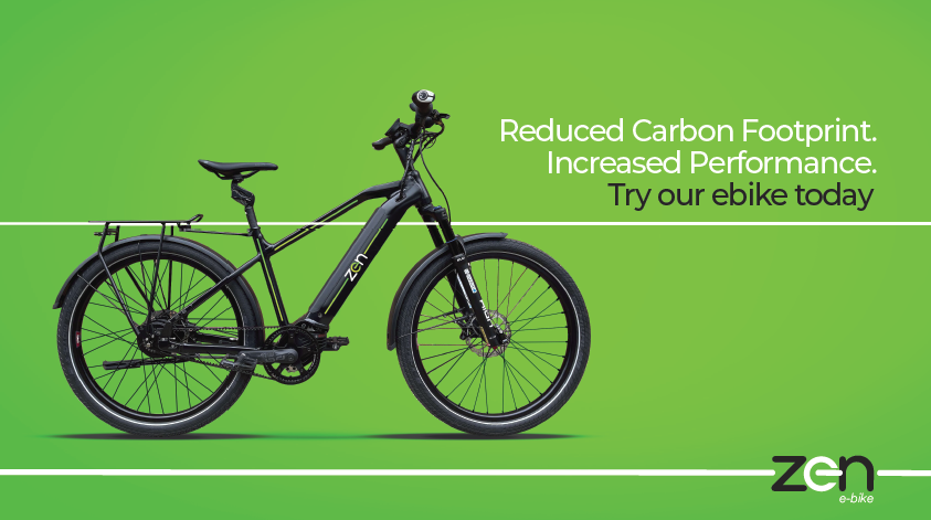
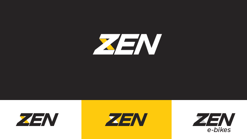
Option 1: The theme is infinity and our USP of long-range, long-cycle life batteries
1636673905524.png

1636673923293.png

1636673955607.png


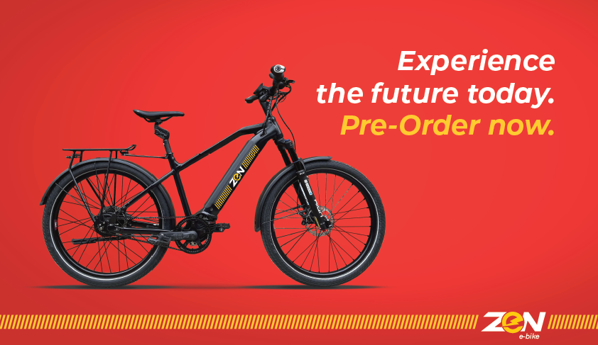
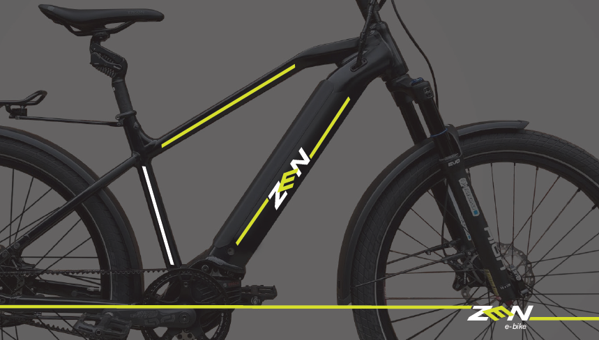
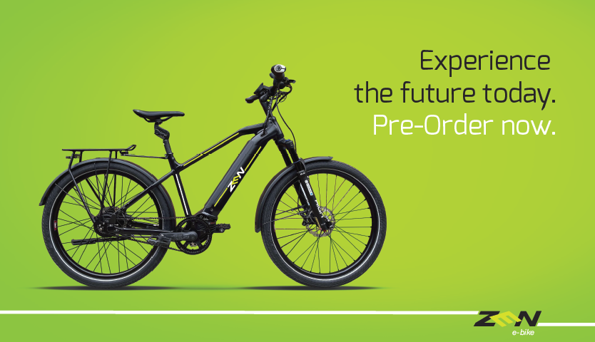
Option 2: The theme is connectivity. E-bike connects people and places.
1636674030092.png

1636674056088.png

1636674070436.png


Option 3: The theme is transformative. E-bike transform the old into young
1636674196097.png

1636674207685.png

1636674221743.png


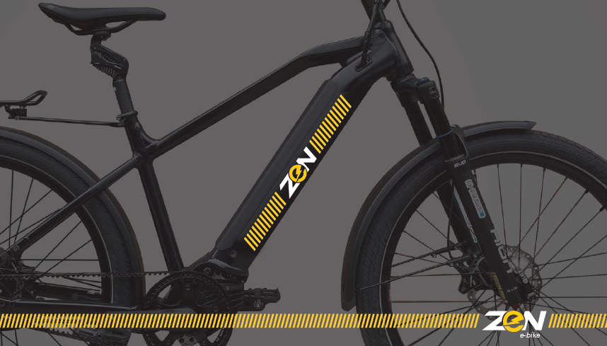
Option 4: The theme is powered on. E-bikes can initiate your journey into the world of clean transportation
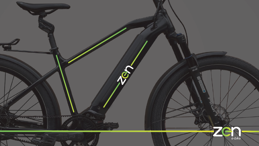
1636674291904.png

1636674305892.png

1636674324366.png


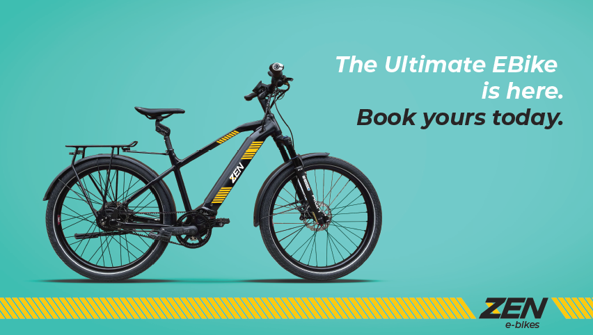
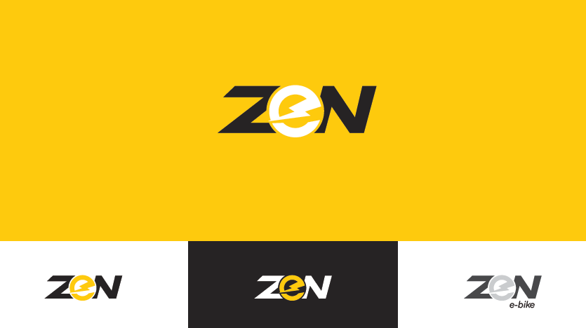
Option 5: The theme is electric. An immediate connection to the world of EVs.
1636674386527.png

1636674404452.png

1636674417825.png


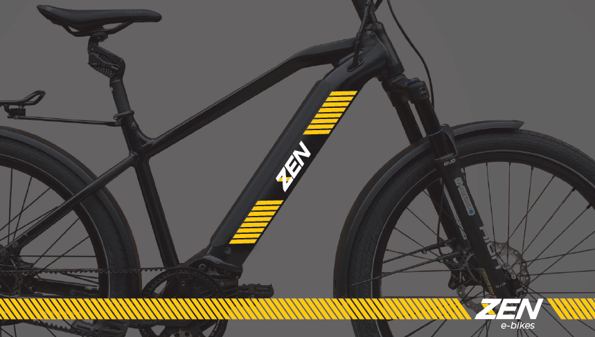
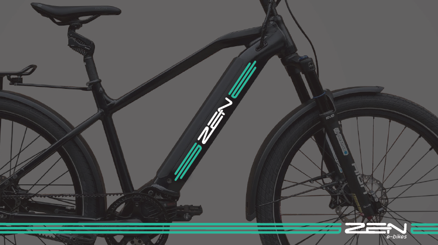
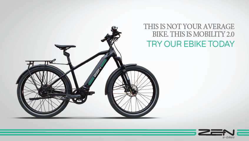
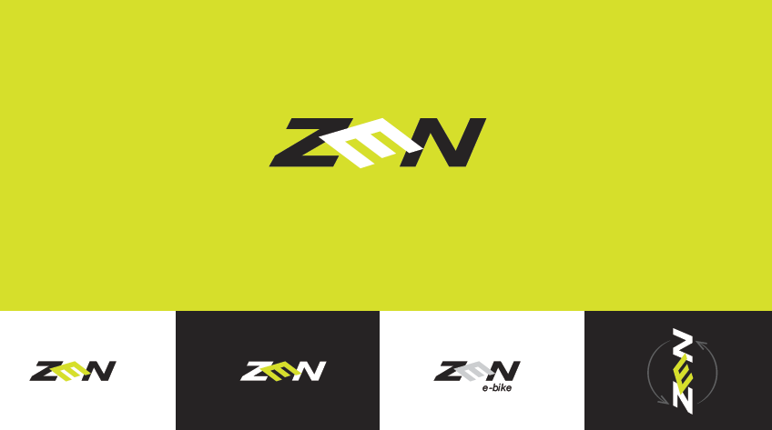
Option 6: The theme is ambigram. A logo that is readable from multiple directions
1636674468324.png

1636674490060.png

1636674520641.png
 
I like the #5 ZEN but with the #4/6 graphic stripe on the DT only. Would be nice if the stripe and e were reflective also.

Getting to be quite the pro effort you are doing Ravi, congrats!
 
Number 4 best, number 6 second choice. Number 2 probably worst, I find it hard to read or to recognize .
 
I still like #3 with its calm promise of ‘Zen’. #6’s E is cantered though deciphered easily unlike #5. Also the E is linked with color with the graphic lines. So #6, yeah too
I’ve got another 6K to do on my Trek before I’ll allow myself a Zen…but I could go south for the winter and speed things up
 
Thanks for the feedback and please keep it coming. Greatly appreciate it.
We try to avoid being in our bubble and listen to what experienced E-bikers think...
Looks like 4,2,3 have more appeal ... we will see if we can improve upon them..
 
To be honest, I like your existing logo best. It looks good and is understated. I think these options all look too busy.

There are bits and pieces here I like.

I think I'd rank the bare zen logo in #4 (powered on) best with some tweaks.
- The e can look more like a power button symbol without off centering the -.
- kerning between the z and n looks a little weird.
- the single line graphics are on the less busy side, though could use fewer lines.

#6 (ambigram) looks alright, though not a fan of the off camber E, and not sure how it ties in to the rotated Z.
The line graphics are on the less busy side compared to other options.


The graphics in #2 (connectivity) could be tweaked to look like a waveform, capacitor, battery etc. Something electric themed.

Option #5 (electric)'s lightning bolt e looks like it belongs on a super hero.
 
I like the on bike accent graphics of 1, 4, and 5 ... but 6 is annoying.
I like the font in 1 for on paper/screen but it works less well on the bike. 3 (in a different color) and even more so 4 are my fav fonts/logo. Again 6 is just annoying. The 5 font/logo is a bit too cute for my liking as I seem to have to look twice to read it ... but maybe fine with a younger demographic.
 
My 2cents…
6 with just the battery compartment
The graphics of 3 with the printing of 4

My opinion on this is a little weak ,I wear plaids and stripes at times, not good taste in appearance… but ask me later how it rides and I will have some strong opinions for you
 
Honestly, none appeal that much to me. Less is more. In that regard, 4 is the least of the evils, cleaner if you ditched the extra pinstripes. Take a cue from Biktrix. They made some really fugly bikes with stripes. Don't go there.
 
Back