You are using an out of date browser. It may not display this or other websites correctly.
You should upgrade or use an alternative browser.
You should upgrade or use an alternative browser.
Which colors looks better?
- Thread starter Ravi Kempaiah
- Start date
Ravi Kempaiah
Well-Known Member
- Region
- Canada
- City
- Halifax
We took the suggestions seriously and we will be implementing the logo design for 2023 bikes.
Many of the components had gone into production with the current logo, so we decided to keep it like that for now.
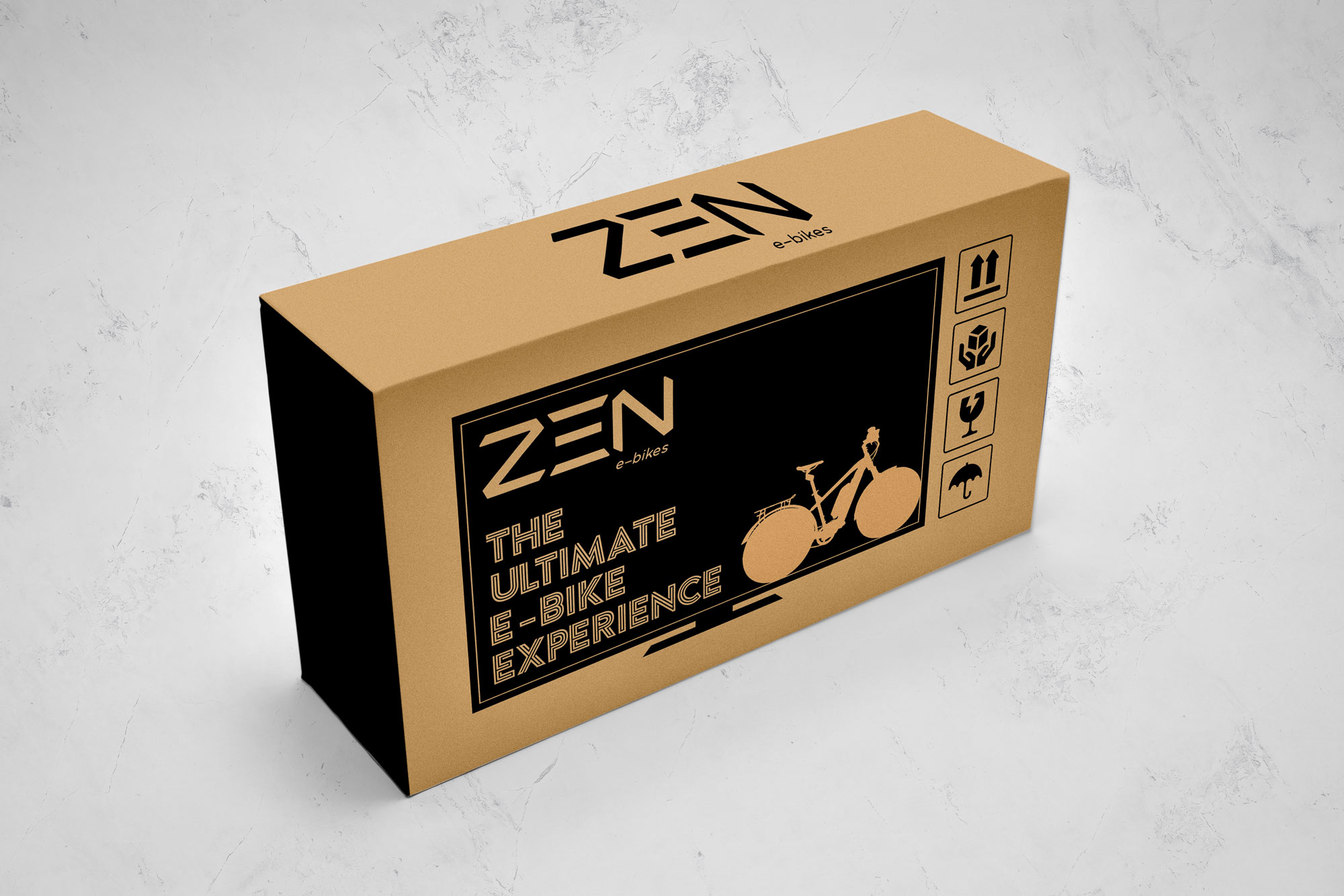
As you can see below, we are designing our own shipping boxes.
We would also consider helpful suggestions for shipping material and boxes.

Many of the components had gone into production with the current logo, so we decided to keep it like that for now.
As you can see below, we are designing our own shipping boxes.
We would also consider helpful suggestions for shipping material and boxes.
Ravi Kempaiah
Well-Known Member
- Region
- Canada
- City
- Halifax
I might only mention ebike in small print and make the bike more subtle so it looks more like a TV, assuming that's your goal. Maybe picture a charger or plug instead of bike?
Good suggestions. We implemented that.
Ravi Kempaiah
Well-Known Member
- Region
- Canada
- City
- Halifax
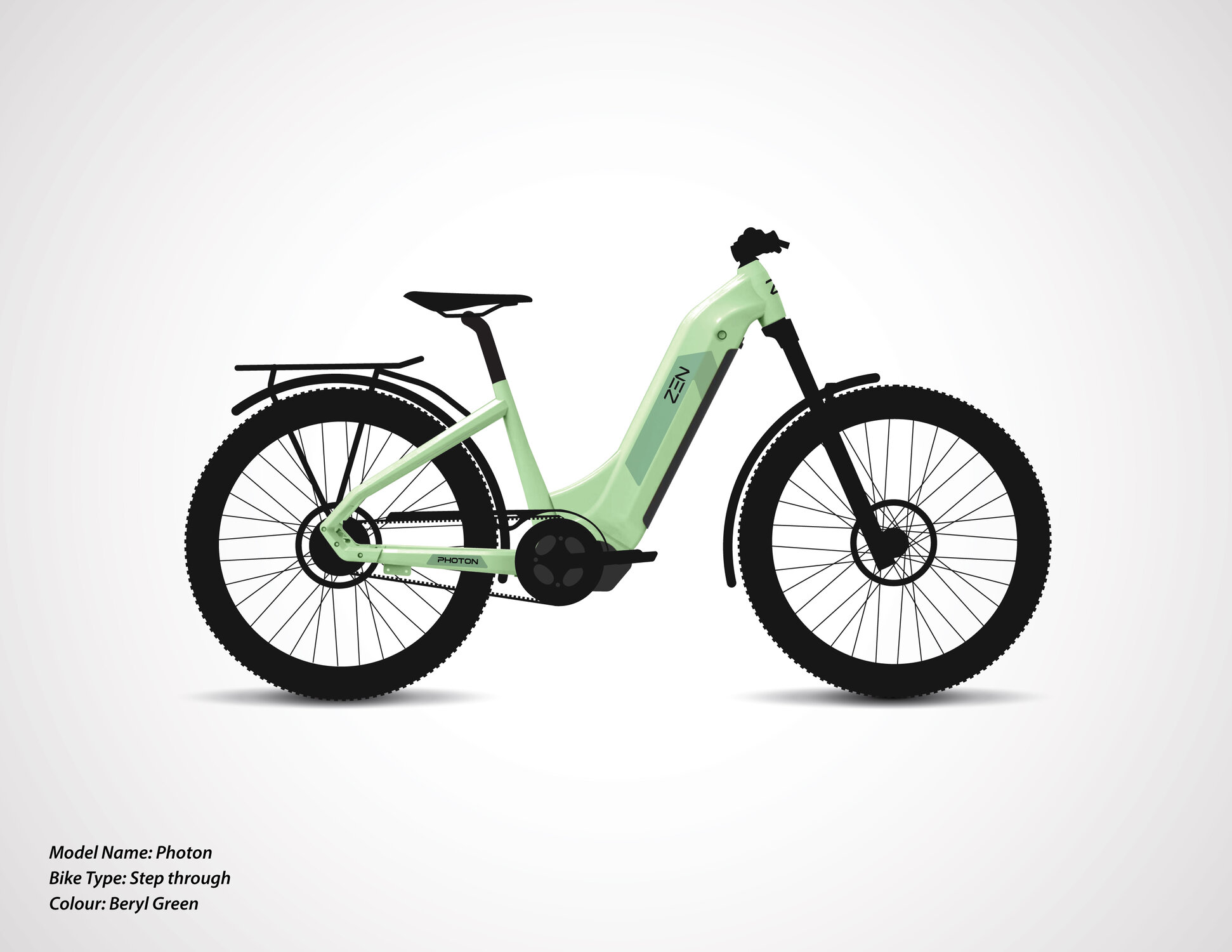
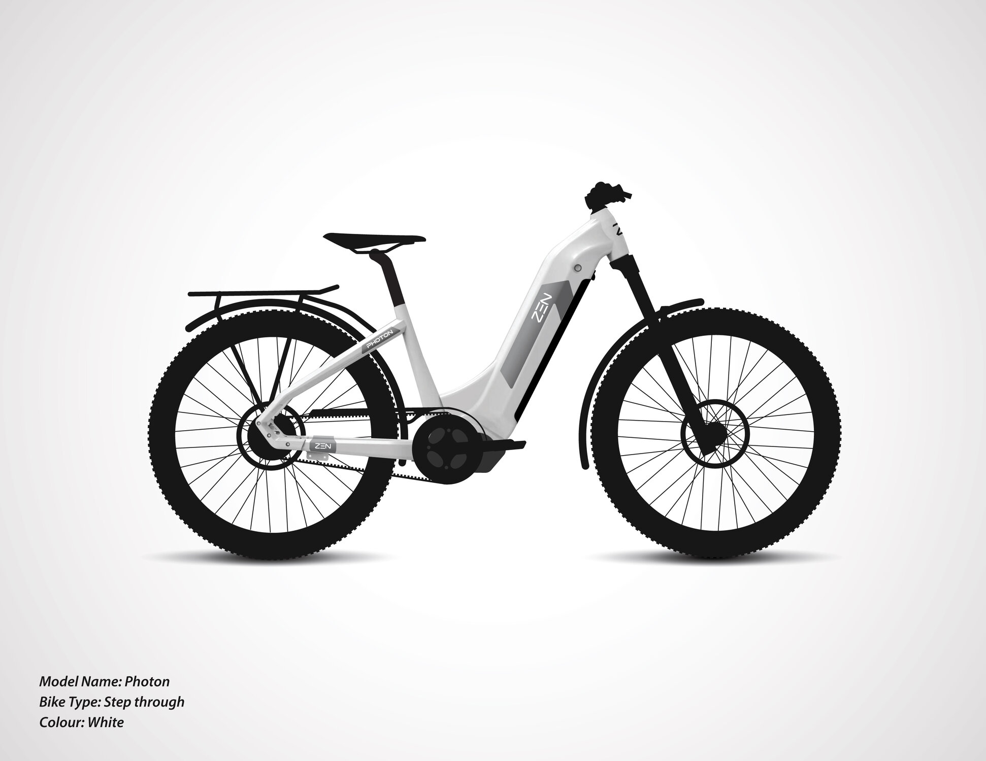
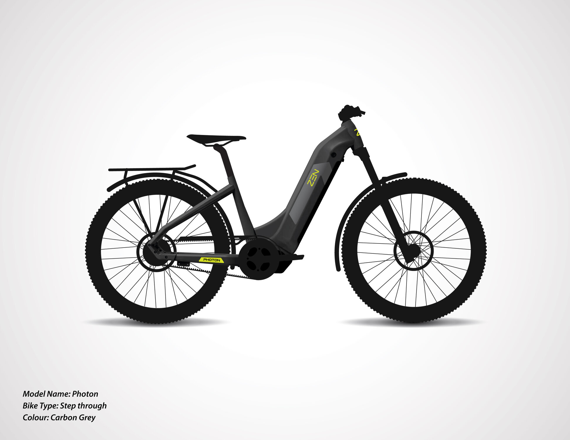
Eager to get feedback from the community. We need to pick 2 colors out of 3 mentioned below.
Please let us know what works best: subtle green, white, or grey.


Please let us know what works best: subtle green, white, or grey.
Mr. Coffee
Well-Known Member
- Region
- USA
- City
- A Demented Corner of the North Cascades
I like the Carbon Grey best.
If I could only have two of them ... in an ebike lineup in a bricks and mortar store, I think I'd sell more of the green and grey. If I was selling online only and primarily though my own website I think white and grey.
White and grey would appeal to most folks (or more accurately no real issue with either, so the bikes will be sold on their other attributes). But in a competitive line up I think the green would help the bike to stand out a bit against that other competition vs. the white (plus it has a bit of a retro vibe, it takes me back to the old Bianchis). The grey is just going to appeal more to the male buyers no matter what the circumstances.
White and grey would appeal to most folks (or more accurately no real issue with either, so the bikes will be sold on their other attributes). But in a competitive line up I think the green would help the bike to stand out a bit against that other competition vs. the white (plus it has a bit of a retro vibe, it takes me back to the old Bianchis). The grey is just going to appeal more to the male buyers no matter what the circumstances.
Deacon Blues
Well-Known Member
The dark grey looks classy. The green would be my second choice.
Gionnirocket
Well-Known Unidentified Member
- Region
- USA
- City
- Y. O.
Tough_guy Grey
Jeremy McCreary
Bought it anyway
- Region
- USA
- City
- Carlsbad, CA
White by a wide margin.
Gionnirocket
Well-Known Unidentified Member
- Region
- USA
- City
- Y. O.
Choosing a bike color for visibility is like choosing a condom color for effectiveness 
I am not sure I agree completely with the above or I would pick the color I liked better. I wear hi viz jackets have lights on, , reflective tires . I believe that if I am seen less chance of an accident . I don't think the color of your condom is going to change the chance of catching anything or preventing a pregnancy, been at least 13 years since I had to wear one ,maybe technology has changed and I am not aware??
Taylor57
Well-Known Member
I like the white. How much?I vote for the white for visibility, but the carbon grey looks the best.
Similar threads
- Replies
- 7
- Views
- 5K
- Replies
- 0
- Views
- 1K
- Replies
- 5
- Views
- 14K


