You are using an out of date browser. It may not display this or other websites correctly.
You should upgrade or use an alternative browser.
You should upgrade or use an alternative browser.
Vote! Do you like old or new color layout for forum?
- Thread starter El_Binco
- Start date
DaveMatthews
Well-Known Member
I'm good with it.
Nvreloader
Western Nevada
- Region
- USA
Now I can see the forum, I am color blind to several colors.........ymmv
El_Binco
Active Member
- Region
- USA
Didn't think of this, I'm glad more people can see now.Now I can see the forum, I am color blind to several colors.........ymmv
Jeremy McCreary
Well-Known Member
- Region
- USA
- City
- Carlsbad, CA
Now that links stand out from regular text again, I prefer the blue. The green was fine for me, but if the blue works better for colorblind users, it should stay.
m@Robertson
Well-Known Member
- Region
- USA
I don't see any reason to complain. The forum layout is effectively identical to what it was. Just blue where there was green. I'm not colorblind to anything so no preference there.
I'll put this out there: For any screen where you have to stare at it for a lengthy amount of time, its easier on the eyes to make the background grey than it is to make it white as we have here. White reflects (or in this case shines) light and is essentially brighter. You can lower the volume level, so to speak, to a degree without affecting contrast. Its something we did on an automotive forum I was admin'ing and besides the usual neverending bitching and moaning from some usual suspects, was an appreciated change by the general population.
Take this to an extreme and a black background is the best for brightness to the eyes. However reading comprehension and contrast suffer mightily if you do that. Black background with yellow foreground is known to be the best contrast visually but its awful for getting people to try and read it comfortably. Best of both worlds is some level of light grey background to take the edge off, with black text and strong dark colors like dark blues or even maroons for enlarged text.
Something we used to take as a mantra when I was doing advertising work: Best contrast and the most readable text was found a century earlier in newspapers. Grey-ish paper, serif'd fonts and black text (also narrow columns but thats out on a computer screen).
Jeremy McCreary
Well-Known Member
- Region
- USA
- City
- Carlsbad, CA
Totally agree about white backgrounds. Personally, I like white text on a black background, but I gather that's not universal. When I see yellow on black, I run the other way.Something we used to take as a mantra when I was doing advertising work: Best contrast and the most readable text was found a century earlier in newspapers. Grey-ish paper, serif'd fonts and black text (also narrow columns but thats out on a computer screen).
Yellow on black ... it reminds me of the Amdek monochrome CRT monitor on my first IBM PC/XT home computer back in the early 80's!When I see yellow on black, I run the other way.
")
AguassissiM
Well-Known Member
I did like the old color scheme because it was very easy on my old eyeballs however if the new color scheme helps folks to see things better I`m all for it, come to think of it the latest shade of blue is definitely growing on me since it actually matches the backlight of my keyboard plus it makes everything pop out on a dark screen reader much cleaner.
 Thank you Court for constantly improving the forums and our experience here, we all appreciate all your hard work.
Thank you Court for constantly improving the forums and our experience here, we all appreciate all your hard work. scrambler
Well-Known Member
- Region
- USA
- City
- Bay Area, CA
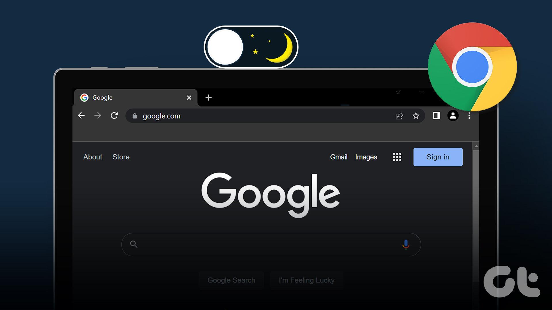
Chrome has an automatic dark Theme for web sites you can enable
 www.wisestamp.com
They are supposed to have a per web site option, but I could not make it work

 beebom.com
There is also supposedly an extension that can do it, I have not tried it yet.
 www.guidingtech.com

 chrome.google.com
Turn on and off dark mode on Chrome
Set dark mode on google chrome on a desktop or mobile and select dark theme or night mode on PC (Windows 10), Android, Mac, and iPhone.
www.wisestamp.com
They are supposed to have a per web site option, but I could not make it work
How to Enable/ Disable Dark Theme on a Per-Site Basis in Google Chrome
Google Chrome now has an option to enable or disable forced dark mode for specific websites. Here's how to use the feature right now.
There is also supposedly an extension that can do it, I have not tried it yet.
How to Force Dark Mode on Google Chrome for All Websites
Unable to use a website with dark mode on Google Chrome? Here's a guide that will help you force dark mode on all websites in Chrome.
www.guidingtech.com
Super Dark Mode
Switch all websites to dark mode. You can darken all sites and also customize colors for the sites you want.
Last edited:
TomD
Well-Known Member
I may be in the minority, maybe not looking at the poll results, but I find the blue theme nauseating. I don't know why, I generally like blue, but this theme just grates at me. I've seen a lot of forums in my day, actually have administered one for 20+ years, and have to say the old green theme ranks among one of the best I've ever seen on the net. I was even considering migrating the forum I administer to xenforo software and cloning it. I don't hang out here much any more, and to be honest the theme is one of the reasons I just don't look forward to coming here, the blue is just is just so in your face. Weird, I know, just being blatantly honest though. Would it be possible to add the old theme back as a user preference? Pretty sure the xenforo software has that as an option.

Now I remember; still no preference.Some pages still have the old theme. Here's a sample.
Similar threads
- Replies
- 98
- Views
- 7K
- Replies
- 35
- Views
- 947
- Replies
- 10
- Views
- 508