You are using an out of date browser. It may not display this or other websites correctly.
You should upgrade or use an alternative browser.
You should upgrade or use an alternative browser.
Feel like your bike frame lettering is like a giant billboard?
- Thread starter gregorb
- Start date
Reid
Well-Known Member
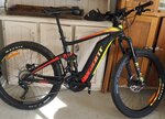
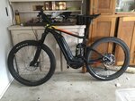
I agree! Fortunately for me, the black on red frame Juiced logo is not obnoxious or dominating. So I can leave it. I
Refinements to my CCS frame is the ONE thing I have not done to the bike. Wait. Correction: I mashed the chainstays so I can run 2.35" tires. That would be classified as a destructive refinement, I think, grin!
Refinements to my CCS frame is the ONE thing I have not done to the bike. Wait. Correction: I mashed the chainstays so I can run 2.35" tires. That would be classified as a destructive refinement, I think, grin!
christob
Well-Known Member
I think that the big splashy graphics/lettering was part of what turned me off a bit, aesthetically, when I was test riding. The bike I ended up with, by Vintage Electric Bikes has no applied graphics anywhere; only a metal low-relief oval badge centered on the front below the handlebars. I will freely admit that the handsome looks of the bike were a very big draw above and beyond the tech specs.
Last edited:
Over50
Well-Known Member
Do you think all the lettering and or graphics on your particular brand bike frame is all too much or doesn't bother you at all? Larger lettering and gaudy graphics or a cleaner more refined look? Have you made any refinements to your brand frame?
For me, less is more particularly when using and locking bikes in cities. A complaint I have for Haibike is there is just too much going on with the branding and paint jobs. Slapping stickers on the battery packs and having a portion of the brand name on the battery pack and a portion on the frame is just silly (IMO). So when I throw on a different battery pack I am then riding my 'ike' instead of my 'Haibike'. I even wish the Suntour suspension forks on my two commuters (Riese and Muller particularly) didn't have so much going on.
I recall a few years ago,when I was shopping for a regular bike, that I stumbled on a brand whose paint and lettering was reflective and you could order it with various levels of bling (can't recall what brand it was). I'm all for that: make some of that bling at least practical. I definitely prefer toned down colors and minimalist branding.
Agreed. Theft issues surely increase with large standout identifying lettering and graphics. Hopefully, manufacturers will find a middle ground or give choices.
I think that the big splashy graphics/lettering was part of what turned me off a bit, aesthetically, when I was test riding. The bike I ended up with, by Vintage Electric Bikes has no applied graphics anywhere; only a metal low-relief oval badge centered on the front below the handlebars. I will freely admit that the handsome looks at the bike were a very big draw above and beyond the tech specs.
Wow. Those are nice looking bikes. All about the design, not the lettering or graphics.
Barry S
Well-Known Member
For those of you with the black RadRover, Hot Laps Graphics sells a "Carbon Fiber Stealth Graphic Kit", which conceals all the Rad advertising on the bike including the battery back. Ordering mine tonight.
christob
Well-Known Member
For those of you with the black RadRover, Hot Laps Graphics sells a "Carbon Fiber Stealth Graphic Kit", which conceals all the Rad advertising on the bike including the battery back. Ordering mine tonight.
hehe... clever idea!
I have a pair of all black N!ke brand sneakers -- but with a white swoosh and white sole-edges. (This was before I found similar all-black-everything Ad!das)... so I used a Sharp!e marker to black out the swoosh and the sole-edges. Similarly, when I got my last Canon camera, I blacked-out the white-thread embroidery of the Canon logo embedded in the otherwise black neck strap---why, oh why would I want 2" tall, high-contrast lettering on my neck strap, advertising for all the world from across a crowded tourist plaza somewhere on vacation, "This guy is using some nice Canon gear"...
Barry S
Well-Known Member
Not to get off topic, but the worst for me has to be the big "N' on New Balance shoes. I love their shoes, but the N just kills the aesthetics. Oh, and the first thing I remove after buying a car from a dealership is their license plate frame(s). If they'll pay me to advertise for them, I'll leave them on.
For those of you with the black RadRover, Hot Laps Graphics sells a "Carbon Fiber Stealth Graphic Kit", which conceals all the Rad advertising on the bike including the battery back. Ordering mine tonight.
Sharp! Hopefully they start selling some for other bikes in that line. Have the RadCity.
Barry S
Well-Known Member
By the simplicity of the 1-page website and fancy font, I figure they're making these at home. With that said, send an email and ask if they can do a set for the RadCity. They may ask you to take some measurements for them if they can't access a RadCity.Sharp! Hopefully they start selling some for other bikes in that line. Have the RadCity.
By the simplicity of the 1-page website and fancy font, I figure they're making these at home. With that said, send an email and ask if they can do a set for the RadCity. They may ask you to take some measurements for them if they can't access a RadCity.
Good idea..
Pvc tape that builders use to protect alloy window frames is cheap and leaves no residue when removed
Attachments
Nova Haibike
Well-Known Member
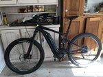
I don't like the "murdered out" look, so I am glad my bike has a bit of color. The graphics are fine by me.

sonusfaber#1
New Member
Well, the Tangerine Dream certainly stands out.......anything that makes us more visible to motorists is a
good thing IMHO

good thing IMHO
Pvc tape that builders use to protect alloy window frames is cheap and leaves no residue when removed
Sounds like a good alternative to electrical tape, which would work but isn't wide enough in most cases.
Sounds like a good alternative to electrical tape, which would work but isn't wide enough in most cases.
Electrical tape leaves residue when removed and is a PITA to cut to shape ,plus this stuff is available in variable sizes ( see the tube in the background - 150 mm wide )
Eg ( nb this is an australian website) http://www.cpsupplies.com.au/Adhesive-Tapes/Protective-Tapes/pl.php?resetbrand=1&resetclearance=1
Last edited:
ebikemom
Well-Known Member
I like the black-and-green design of my bike--black handlebars & tires, black non-dominant logo. Wouldn't change a thing. I do like the non-dominant logo, even though I'm very happy with the brand. If a bike looks great (or cute, in my bike's case), why not let people be curious and look a little to figure out the brand? It is nice not to be riding around on a billboard.
Last edited:
Electrical tape leaves residue when removed and is a PITA to cut to shape ,plus this stuff is available in variable sizes ( see the tube in the background - 150 mm wide )
Eg ( nb this is an australian website) http://www.cpsupplies.com.au/Adhesive-Tapes/Protective-Tapes/pl.php?resetbrand=1&resetclearance=1
Thanks for the great info.
Similar threads
- Replies
- 15
- Views
- 4K
- Replies
- 3
- Views
- 2K
- Replies
- 47
- Views
- 4K